Since I last re-designed my website in 2012 there has been a lot of change in web technologies and best practices! To modernize my website for 2020, I decided to make big changes in the website’s user experience and my development workflow.
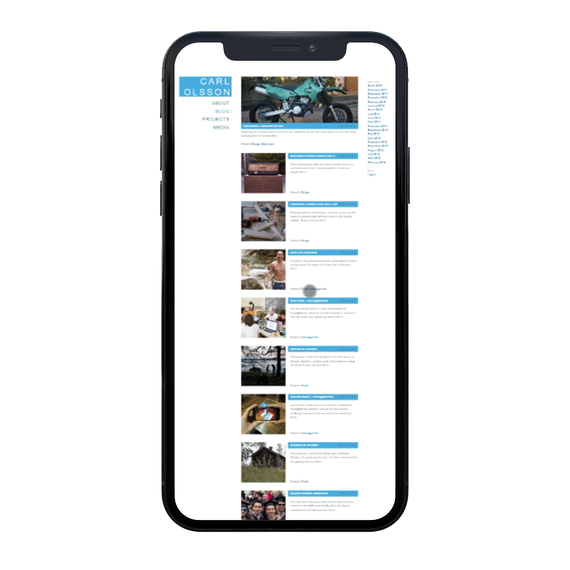
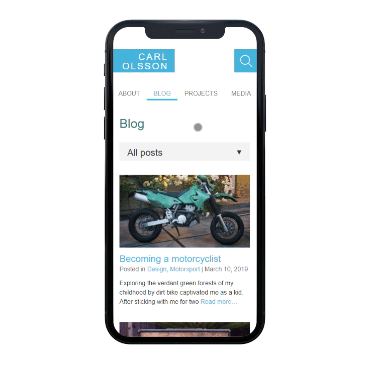
The biggest user-facing change is the responsive layout, which adapts to different media formats (mobile vs. desktop). Whereas the old site was almost unusable on mobile, the new site was designed starting from the mobile experience.
Changes I made to make the site more usable on mobile include:
- Responsive layout
- Larger click targets (using fingers vs mouse)
- Less vertical compression (vertical margins/padding, line height)
- Large and easily visible user controls (search bar, select dropdown, and tabbed menu bar)
- No hover effects (mobile users can’t use hover)
Like most of my design, I wanted to keep a minimalistic and almost brutalist aesthetic that didn’t use unnecessary borders, drop shadows, gradients, backgrounds, or colors.
I tried to analyze the user experience by thinking about information architecture and user flows such as:
- blog readers that want to read related content and peruse my bio
- people interested in browsing media (photo, video, audio)
- potential employers trying to view resume and projects and contact me
Because of the user flows mentioned above, I implemented:
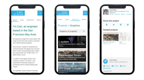
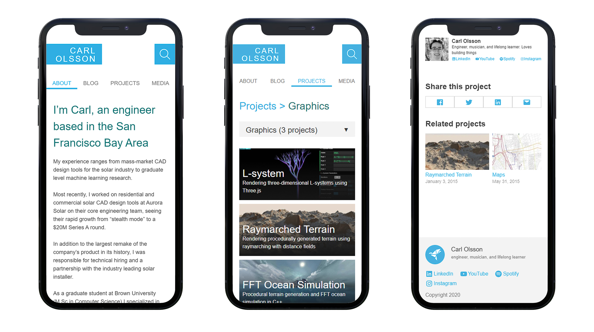
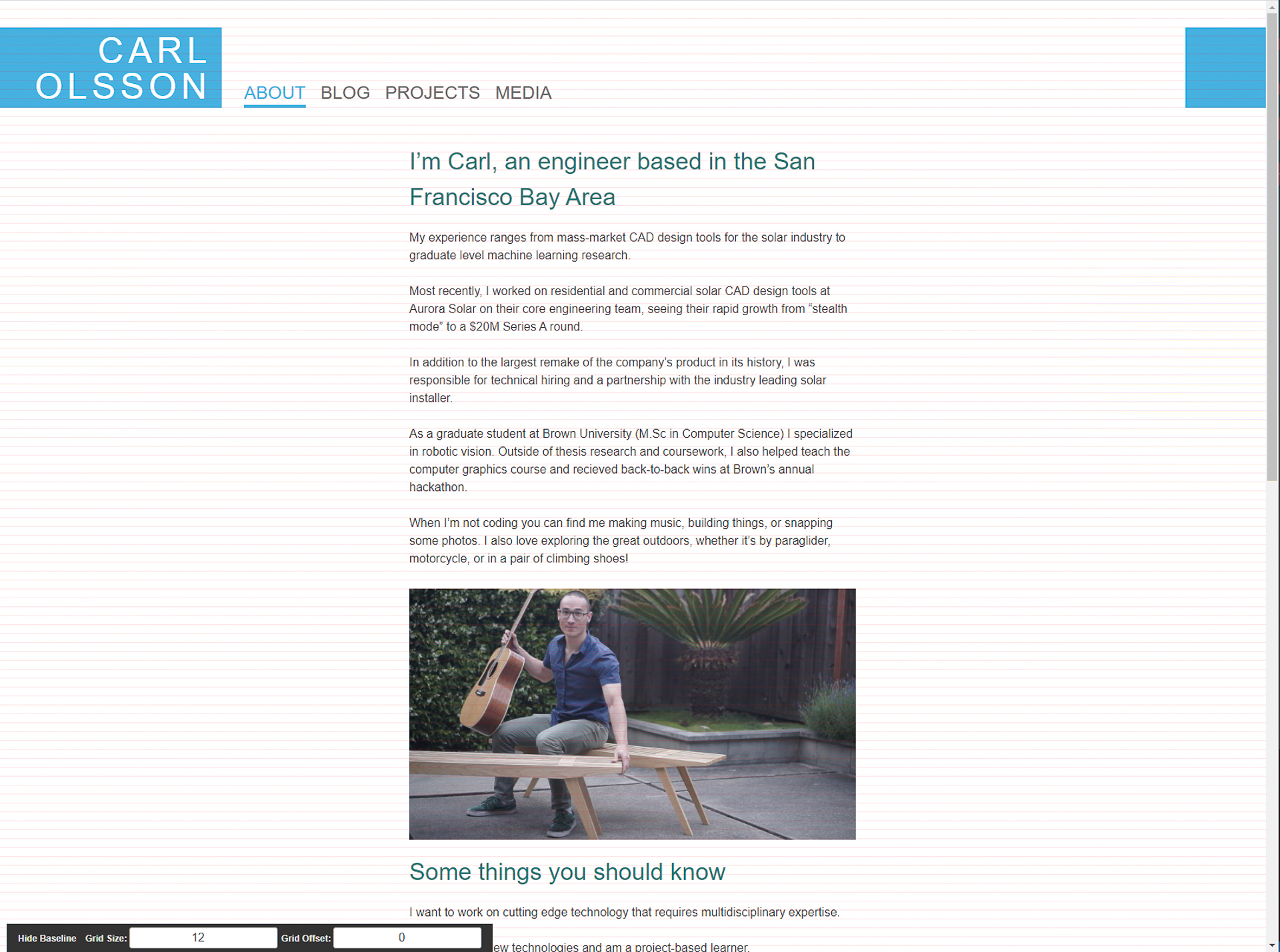
- About page is now the landing page. Contains 75% of the information from my resume, links to projects + posts, and contact information
- Navigation breadcrumbs appear in the title so users that arrive at a blog post or project are encouraged to view index pages (i.e “Projects> Graphics”)
- Category select dropdown present the various topics covered by blog posts and projects and their frequency (i.e “Graphics (3 projects)”)
- Page footer and author vCard contain social media links to encourage user engagement with social media accounts
- Related posts and projects are shown at bottom of posts/projects to encourage users to continue reading
Now that I’ve briefly gone over my design thinking I would like to explain how the changes made to my development workflow reflect modern trends and best practices. Here are the technologies I’ve utilized:
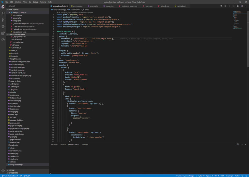
- Webpack is used to run a dev server and build assets
- Babel uses syntax transformation and polyfills to compile ES6 into backwards-compatible JS
- Sass has variables, mixins, and functions to make writing CSS easier
- CSS Grid and flexbox are used for responsive layout without using jQuery or JS
- BrowserSync is used to reload the dev server when changes are detected
- ESLint is used to write high-quality JS according to modern best practices
- PostCSS Preset Env is used to add vendor prefixes and polyfills to CSS for cross-browser compatibility
- Github workflows are used to ensure code quality and test with different versions of node
- npm is used to maintain packages and their dependencies
After spending three years developing a single page application in Ember I was also curious to see if a JAMstack made sense for my site. Specifically, I was interested in a framework called Gatsby.js which is a Progressive Web App (PWA) framework that promises blazing fast performance with modern tooling (Node, npm, GraphQL, CSS modules). Here’s my list of pros + cons of switching to a PWA framework:
- Pros
- Faster page load (although WordPress can be significantly sped up with caching)
- Handles low-bandwidth connections better (lazy loading, service workers)
- Modern development (JS vs PHP)
- Less server resources needed
- Cons
- WordPress has excellent tools for writing and previewing posts
- WordPress has a huge community and is generally faster to develop
- Maintenance and development with WordPress requires less technical expertise
With these in mind I ended up choosing to continue using WordPress. Currently my site doesn’t receive a lot of traffic and its few visitors typically have reliable internet connections. Most importantly, I figured that with my limited development time it’d be more efficient to start with WordPress that I could later convert to Gatsby. Given more development time I’ll definitely think of switching to Gatsby or another PWA framework!