It all started in February 2011, when I decided to try developing a personal website. I downloaded Adobe Dreamweaver and learned the basics of HTML and CSS. I used mostly pre-built Spry elements for menu dropdowns and image galleries. After barely a week of development, I bought the domain and hosting service at www.fatcow.com. Thus, www.carl-olsson.com was born. The original website was very simple with a white background and limited use of graphics and fonts.
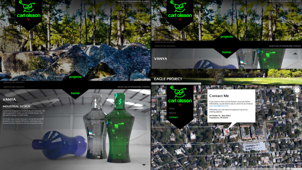
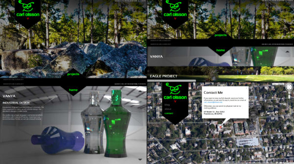
The next iteration was much more advanced and incorporated advanced jQuery and JavaScript animations. I was trying to create a user experience that was unconventional through the use of sliding UI elements, embedded fonts, Google Maps integration, and a flexible fullscreen layout.
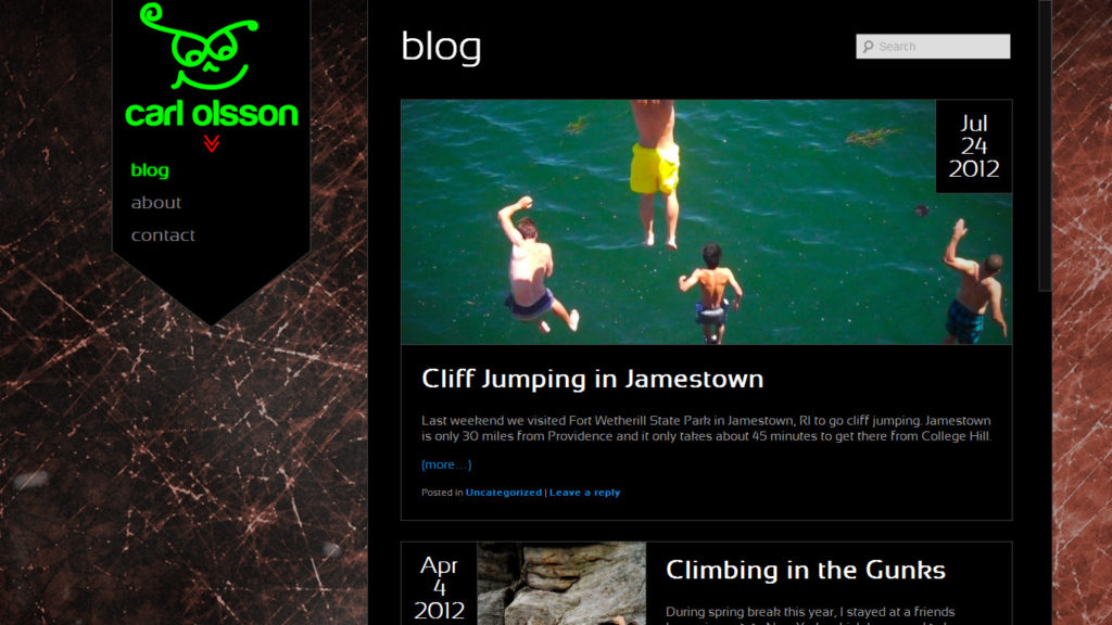
While the layout was interesting, it wasn’t the most user friendly or the prettiest. The use of white text on a dark background strained the eyes and some of the animation was clunky and superfluous. In addition, there were few consistent visual design cues and the design was pretty inefficient.
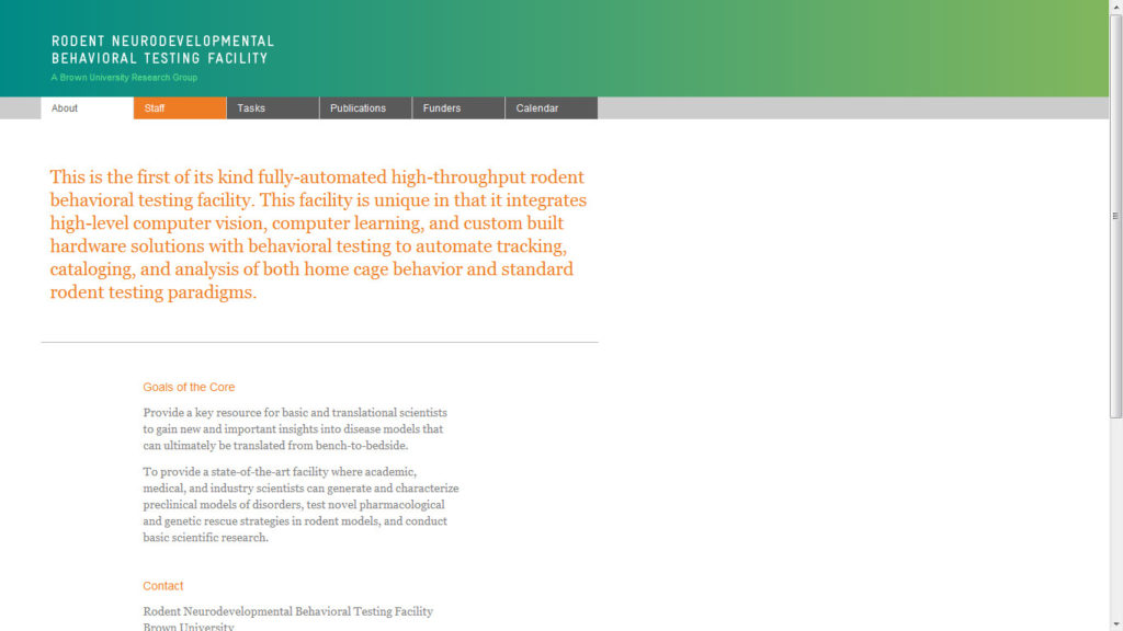
Coding the second iteration of my personal website paid dividends though. Because of my web design experience I picked up two web design jobs at Brown University, where I was to create the new web homes of the Serre Lab and the Rodent Neurodevelopmental Behavioral Testing Facility. For these projects, I worked with designer Eugene Park, a graduate student from the Rhode Island School of Design (RISD). He provided me with Adobe Illustrator mockups and I translated these into code.
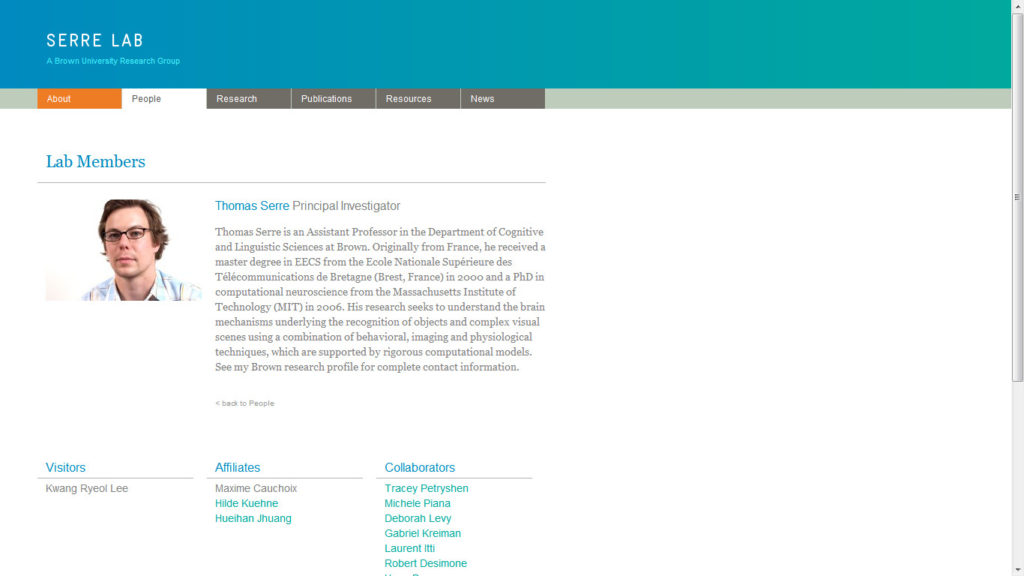
Both websites use WordPress as a CMS. Developing them forced me to understand the intricacies of WordPress development. More importantly, working with a graphic designer taught me about the importance of typography, alignment, color, and visual consistency.
Third time’s the charm they say, and I expect that the upcoming third revision of www.carl-olsson.com will be vastly superior to its predecessor. With the third revision, I’m taking into account all the things I’ve learned about programming, graphic design, and user interaction design. Below I’ll share some of my thought process when designing my new website.
- Grid Size and Baselines
- Choose a grid size and stick to it! Keeping a consistent grid makes everything more legible and is a design subtlety that will make a design shine. Make sure elements are aligned to your grid and that all text (or as much as possible) is aligned to the grid baseline. I used 20px line height, which is pretty standard. Aligning everything is probably one of the most tedious parts of web design but definitely pays off.
- Kerning and Tracking
- Kerning and tracking have to do with the spacing between characters. It is extremely important to get both right on large text (logos for example)
- Page Size/Speed
- A slow-loading page will annoy readers. Avoid large graphics, complex animations, embedded fonts, or intricate JavaScript.
- White space
- The proper amount of white space goes a long way towards legibility and will make your website that much more pleasant to browse.
- Color
- A fixed color palette is one of the keys to visual consistency. Color is also used to highlight important elements. For example, brigher colors can be used to highlight important elements and dull, subdued colors can be used for less important elements such as copyright notices and footer text.
- Margins and Padding
- Use consistent margins and paddings throughout a website for visual consistency. For example, indent text by the same amount everywhere.